Contents Of A Typical Web Page
The structure page already mentioned that a typical web page has a few larger areas to structure content. These areas are typically defined with semantic elements at the highest level, meaning they are located directly inside of the body tags.
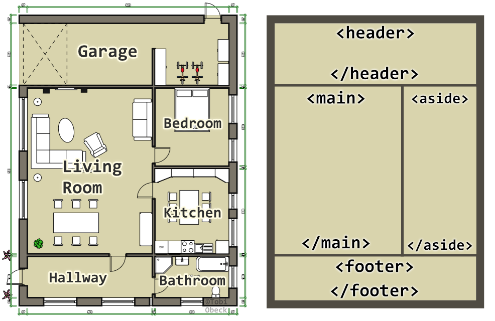
Do you remember this graphic?
 The rooms of a building and high-level elements of a web page are containers for smaller pieces (furniture or elements respectively). They define the structure and give each area a purpose and meaning.
Elements like header, main, aside and footer define areas with the respective meaning. Of course you don't have to strictly follow this structure. For example, your site might not need a sidebar (aside). Later on you can use CSS so that the areas actually take up the space and look as in the graphic above. For now, lets add the following code to your minimal skeleton in the body.
  <body>
    <header><header>
    <main></main>
    <aside></aside>
    <footer></footer>
  </body>
Because the code above wouldn't even display something, it makes sense to nest another layer inside of these tags. A more realistic example would look like this.
  <body>
      <header>
          <nav role="navigation">
              <a>Home</a>
              <a href="/blog">Blog</a>
              <a href="/about">About</a>
              <a href="/now">Now</a>
          </nav>
      </header>
      <main>
          <article>
              <h1>Home</h1>
              <p>bla bli blub some text</p>
              <p>some more text</p>
              <h2>Another heading</h2>
              <p>text about another topic</p>
              <ol>
                  <li>Gold Medalist</li>
                  <li>Silver Medalist</li>
                  <li>Bronze Medalist</li>
              </ol>
          </article>
      </main>
      <aside>
          <h3>Other Interesting Stuff</h3>
          ....
      </aside>
      <footer>Links to my social media</footer>
  </body>
While this doesn't look spectacular, its enough content for now to continue adding some CSS to style this and accomplish the layout of the image above.